10.11.2012

A Million Little Bricks & The Brick Bible; Two Short Book Reviews

Howdy readers. I need to do better at this blogging thing.

I recently got two books on our favorite multicolored plastic subject: A Million Little Bricks by Sarah Herman, and The Brick Bible by Brendan Powell Smith.

Let me preface by saying that both books are beautiful. High-quality glossy paper and quality color prints. Don't get the kindle version, kids. Feel the heft of those dead trees in your hands. Mmmm. Delicious.


A Million Little Bricks is, unlike The Cult of LEGO (also great), a history of the company and the toy—NOT the fan community (although a short 10-page section does mention it, various conventions, and fan projects like BrickJournal). Any readers who can identify sets based on part number will geek out, and anyone interested in knowing detailed stories behind the progression of various LEGO themes, marketing to girls, and a more textured description of the company history and leadership will have a happy read. It's dense reading, but, well, what else are you going to read anyway? This blog?

And the dedication of the book is the cutest: "For Ian—because you love me enough to let me build your Unitron Monorail set 6991)". Collective awwwwww.

The Brick Bible is more or less what you would expect, but it's not a complete Bible at all—that would be quite a bit longer than the 270 full-bleed glossy pages—. The selected scenes are recreated quite literally (sometimes very humorously, sometimes gruesomely, always plasticky) in LEGO. I'm a dirty non-believer, so I enjoy the book mostly as a talking point, but I imagine if you want to engage people with the word of god etc, this is a good way to do so in a more fun format. I'm not sure how seriously one should take it, but I've never met the author face-to-face. 


10.06.2012

Talk too much but not enough its a real cool thing a real cool thing yeah

Vega-3
There are many good things going on with Stefan's latest starfighter. Of note is a great balance between curved and angular wedge pieces; the form doesn't come across first as bulbous or edged. The obnoxious transparent neon colors that I grew up with in previous decades were of hues difficult on the eyes; they have been phased out, thankfully, and Stefan employs a trans-orange canopy of recent production. It works better than anything with the sand blue and dark tan colors.

The incorporation of the unforgiving canopy element is also a success. Some might stray from using it and others like it because of their unfamiliar contours and the lacking aesthetics of their accompanying molds. I think Stephan's success is due in part to the notching on the long blue slope pieces. The notches allow compatibility with parts that might otherwise have intersecting studs. At first they might seem to hinder aesthetics, although here, visible from the front view, they break up the straightness of the wedge just enough to permit a transition from a strait edge to a curved one.

Vega-3
The rear view reveals simpler geometry, which lends itself to being interpreted as serving mechanical function.The angles of the four auxiliary do good to echo the four wings. When viewed from the rear, faces of the angular dark tans wedges form four triangular shapes, highlighted here by the lighting. The longest legs of these seem to come close to tangent to the round thrusters and near parallel to the fins of 47456, forming an imaginary diamond. The triad slits in the sockets Stefan uses for thrusters also hint at this geometry. The one thing that stands out of form are the 8 square insets of 41862.

Vega-3
The cockpit canopy protrudes from the fuselage, visible in the profiles. The orange shape is complemented by a similarly shaped protrusion on the underside. The detail is barely noticeable but it is enough to suggest  symmetry.

Vega-3 Loads of fun, Stefan.

10.01.2012

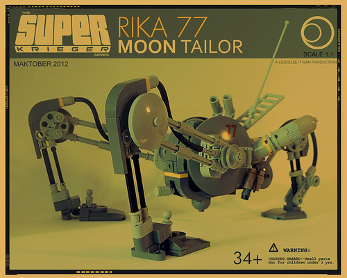
October is Ma.K-tober

Spreading word here of Tromas' Lego Maschinen Krieger building challenge. The parameters of last year's starfighter contest have opened up to include just about anything appropriate for Kow Yokoyama's imagined universe.

This is a fantastic start, I love the presentation: rika_smoke
Tromas' announcement on TBB
.
"Ma.K bricks", the Lego Maschinen Krieger flickr group.

8.27.2012

Wisp - Inter Atmospheric Fighting Pod Dave Steeves. Two familiar images contrasting here: the yellow accents and caution striping hint at something industrial and mechanical, while the form appeals to some sort of insect. Both themes are familiar enough, but at the same time frightening. The probe at the front is delightfully violative. This LEGO advertisement for the 1998 Insectoids theme was before my time, as I was then at the primo stage in life, but relevant:

8.25.2012

Shoot them before they shoot you

Locust
Both the design and the rendering, executed by Genghis Don, are superb. It looks like an elongated version of this fighter craft seen in Cowboy Bebop:


WTo-06B Gunbastard
More Mobile Frame Zero designs from Malcom Craig. This one is delightfully chunky.


The two-tone, patchwork color scheme on flickr user imaginationDUCK's mech works well to inspire urban camouflage. It definitely calls to mind Spook's work, who has been prolific as of late.

8.16.2012

Concept-inspired LEGO design

Nidhogg Dropship
Flickr user Drywall created this dropship. His LEGO rendering is inspired by artwork done by Ukitamkumuki on deviantArt for a Role Playing Game, called "Space Vagabonds", in 2009.

There's a lot of good things going on with Drywall's model. The exposed studs do good to break up the awkward texture created by the slightly beveled edges of tiles. The three color rule is used with some reservations. The aesthetics of the source artwork really comes through, even if the LEGO model is a bit boxier. Fun details include the believably minimal chin and tail armaments, as well as the landing gear.
Nidhogg Landed
Gotta love his choice of coloring on the figures as well. The cardboard backdrop is actually pretty effective.


These armored suits, also part of Ukitakumuki's Space Vagabonds series, remind me of the biosuits from a Niell Blomkamp short that saw popularity during the time that District 9 was being hyped. Twee Affect, on that.   

8.07.2012

So that's what that feels like

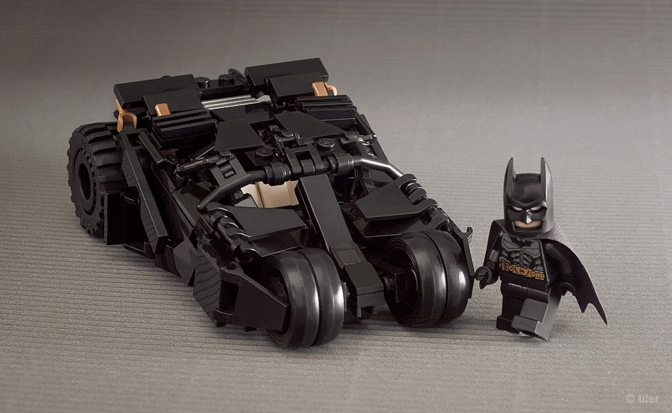
Brickshelf user Tiler has created both these figure-scale and mini "Tumblers" as seen in the Dark Knight Trilogy. Click the pictures for the corresponding galleries, as well as instructions. Check them out!

7.10.2012

SaberStar-a8
It's nice to see something from Dan Jassim. The negative space pattern present on both the fuselage and the engines is a good touch. The 3 x 3 cones fill in the cavity of those awkward canopy bodies.
Mad Hawk - 1
I believe that is a hovercraft corner piece that Dave Steeves is employing as a cockpit on this battletech-inspired mech.

6.21.2012

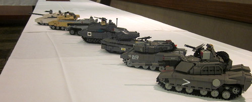
Brickworld 2012 AFV round-up

BrickWorld WiC Tanks This year's BrickWorld saw an extensice lineup of especially well-crafted LEGO Armored Fighting Vehicles. The "cyberpunk" setting allotted these guys some creative license, there are enough flashy futuristic bits to make them stand out from the run-of-the-mill stuff that occupies much of the near-future military genre.
EAC Leviathan MBT Wyyven IFV Ignacio Bernaldez NATO "Demon" Main Battle Tank Carter Baldwin Cataphract MBT Peter Anderson (Shadow Viking) Jaguar IV Dragoon III Forest King (KingBrick)

Here's the same vehicles participating in a brikwars game, the venue is the Pennsylvania LEGO Users Group.


Under The Saharan Sun
Carter and Forest put together this gritty diorama, I took a moment to pose one of my Verticals for a good show.
overseer

6.10.2012

Real World Starfighter Contest

The "Real World" Starfighter contest provides an interesting opportunity for sci-fi builders to dabble with aesthetics far removed from the gunned up darts that proliferate the genre. P. Fieschi's is a great example, his concept presents a product of an arms race gone too far. Spherical parts are used to a great effect, as with all of Pierre's models the "Hercules" maintains a high level-of-detail.

1973 'HERCULES' NUKE PLATFORM

"The nuke was a self propelled Monster of destruction, about 4 or 5 times the size of the Apollo module itself. In the end, officials had no idea what to do with this horrifying piece of engineering that went far beyond mutually assured destruction. For the sake of mankind, the project was discontinued, and the 'Emperor' nuke was fired at the sun."
Starfighter Contest
The contest runs until the end of next month, get building!

5.29.2012

Cole Blaq goes navy blue

T4 Cybagala, Saranyu & Varuna
Tim Gould over on The Brothers Brick featured this before I came across it, but I'm glad to post it here. First, because of the sci-fi builders that see regular plugs on this blog Cole isn't one of them; second, Cole's stuff is certainly good enough to deserve an increased signal radius; and third, because I've thoughts of my own that I get a kick out of seeing published.

Anyway, these are pretty smart near-future designs. Gould mentioned the vivid colors in his post, I'll echo that, as it is my adamant belief that color variety is the spice of LEGO. I can't help but think a trans yellow windshield on the smaller vehicle to match the larger Aliens APC looking thing would be nice, but I'm not knowledgeable of Cole's preferences regarding modding.The wheels are great.


The blue and gold colors on Cole's fan models resembles the liveries of the human faction in the official LEGO "Alien Conquest" line. The subject matter is not different as well, it is as if Cole took the juvenile playset characteristics out of the designs and inserted some worthy aesthetics.


Set reconstruction, a level above "set modding", has been popular lately as the official themes have gotten more niche. 2001's "Alpha Team" line was one of my favorite themes as a young child. After being inspired by the submersible that recently made a limited run via the Couscous Cuusoo program, my interest in tracked ground vehicles (like snowcats!), and remembering the adoration that I harbored for the above set as a third grader,  I might like to do a "cover version" of 6774. To this day springy slat that was used as the catapult is still bent from use. And that skull-spanning grin!


Halfway relevant links:
This Maize-and-Blue "Wolverine". A mecha from Kyle Vrieze's collection of early works residing on MOCpages.com. Even more relevant to those of us, who such as the author dwell in middle Michigan where the MSU / U of M rivalry is a very real and frightening thing.

"I must admit, the Wolverines usually have a better football team, but I think we beat them more often than we really have a right to."

Colonial Marine APC from Aliens
The APC from "Aliens". Created in LEGO by flickr user Larry Lars.

5.24.2012

"Doing it right"

Flickr user Drywall has created exceptional LEGO mecha based on the "Gekko" units from the Sony Playstation 3 title, Metal Gear Solid 4. Theses particular in-game designs have inspired LEGO mecha of my own. You can see the Gekkos moving around and mooing in the video below, real fantastic work on the part of the artists behind the game.

Striders 1

 
The animation and sound effects are so great. A real contrast to the boring legged slabs revealed in the Black Ops 2 trailer.

Sentient Tank 2

He has also created this equally magnificent realization of a "Think Tank" from Ghost in the Shell. Both of José's models stray from their inspirations; while retaining the concepts imagined by original artists the LEGO builder has tastefully added features of his own.

Geoff Herndon's Gekko. It is scaled to the LEGO minifigure, though I daresay the legs aren't spindly enough.

Tim Gould's GiTS Think Tank.

5.19.2012

Antige-V

Quality from Jerac, as to be expected. The angling of the 1 x 1 slopes is good. Retro-future is sometimes gimmicky, but this is great. The patches of color on the body and the offset-antennae greeblie are sci-fun as well. Functionality in mind, the grey railing on the footstep seems redundant, but I guess it looks alright.

Antige-V Hardtop Antige-V I have not yet expressed my enjoyment with his background selection. The concrete is more exciting than texture-less photoshop editing, but it doesn't compete with the models.

5.14.2012

And the art sucks, too

I can't say that I'm very much into playing video games these days. They occupied a great deal of my attention back in junior high school, but I have since lost interest and neglect to keep up on them. That said, the "Call of Duty" franchise has gained a strong following over the past three or four years, and me being in high school amongst the target demographic, I am sure to encounter buzz when new titles are announced.


The Call of Duty franchise was once renowned for its realism in presenting the battlefields of WWII. The trailer reveals the upcoming title, Black Ops 2, is to be set in the future, justifying these legged mechs. Which, if I may offer my opinion, are butt ugly. Perhaps the developers are new and inexperienced at creating futuristic universes and technologies, or maybe it is that they're rushing to crank out a new title for every holiday season and don't the time or resources to put together a better art direction.

Here's some guys within the LEGO sphere doing it correctly.


Dane and FateHeart, respectively. I like how Dane's look as if it was a tracked vehicle retro-fitted with legs, the greeblies are great. FateHeart's is just a fun time on teeny feet, there's good humor in the crewman with the katana as well.


Mladen Pejic, of course.

But this isn't to say that wheels haven't gone out of fashion in the future, as Jas Nagra's recent future-military models prove:

Boar. Runt.
Two years ago I featured a couple of vertical tanks of his design, so he's not all about wheels and tracks. I can really admire Nagra's control regarding excessive detail. No surface is made more complicated than it needs to be, the result is something very clean and functional. As the cluttered Black Ops artwork shows, restraint isn't always exhibited in science fiction artwork.

 
Jacob
Occasional driving force of the blog, self-proclaimed Lukas fanboy, and aspiring engineer, Jacob spends too much time building LEGO, not enough time practicing piano, and not nearly enough time doing school. He also enjoys long sentences. In the instance of blogging, he believes in quantity over quality, wherever quantity can be maintained.
Mike
One of the cofounders of YSAB, and the founder of YSA, Observing Mike actually being productive is a rare occasion. Mike enjoys making outlandish claims in relation to actually building, pretending he's actually sorting his collection, and making excuses for why he hasn't photographed his MOCs. In his free time he enjoys learning CSS from Spook, photography and poking badgers with spoons.
Dean
Occasional builder, occasional blogger, and full-time procrastinator. That's really the only way to describe Dean. He rarely gets anything done, but is a very active lurker. He's probably seen and liked your MOC, but just forgot he had a blog.
Erik
Erik is still a teenager.
Lukas
Lukas is tall, blond, mildly OCD, and doesn't build nearly enough as he would like to, thanks to school. He has a webpage.
Spook (Tim)
The resident codemonkey and graphics person. If something isn't working correctly, it's probably his fault. Fitting to his name, he doesn't post often, but someone has to do this stuff too, right? Spook does build with laygoes, and has his own blog as well.